What this screen does
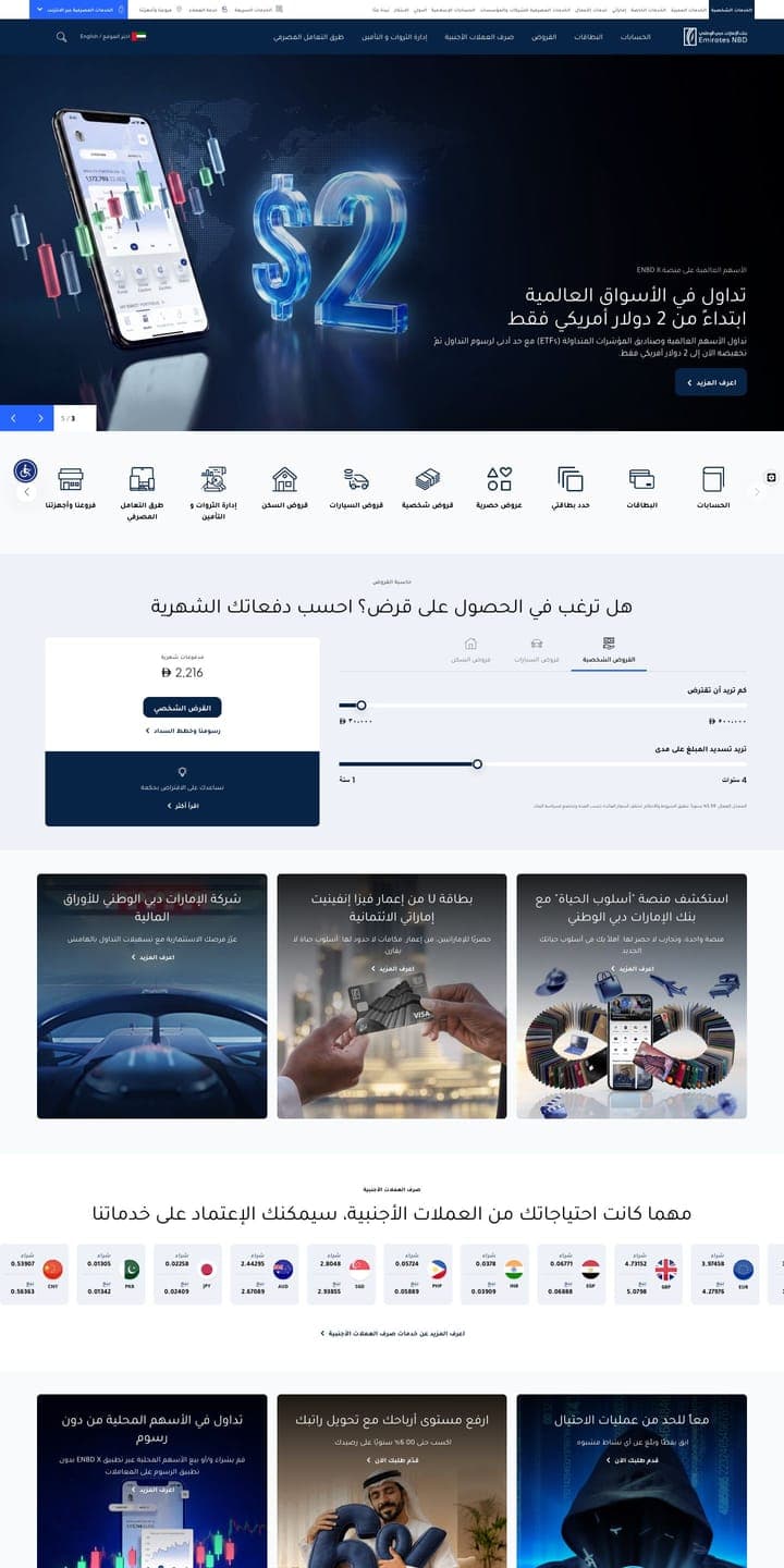
Current uses a dark treatment for a fintech audience. The get started leads with illustration and resolves in 4 distinct sections — a structure you can reuse directly from the Breakdown tab.
- · Accent used sparingly, on CTAs and one metric band.
- · Type hierarchy carried by size and weight rather than colour.
- · Designed for phones; adapted up to tablet and laptop — switch device above.